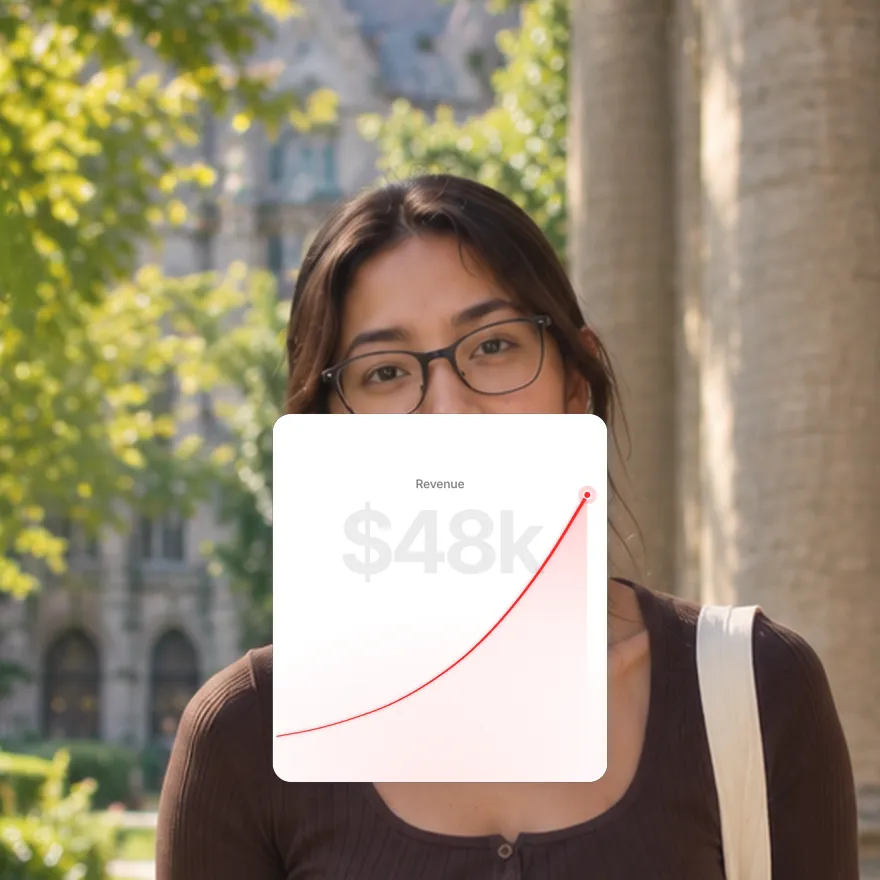
Used by 8,000+ creators
Animated Chart Maker for Video
Type your numbers and watch the chart build itself: bars rise, lines draw, rings sweep and every figure counts up. Nine chart styles, free 1080p MP4.
Free, no sign-up
By Sumit DeyUpdated
What is the Animated Chart?
An animated chart is a graph that builds itself on screen instead of appearing as a finished picture. Bars grow to their values, lines draw from left to right, and the headline figure counts up as it happens.
How it works
Every chart here is a card you fill with your own numbers and labels. When it plays, the shapes grow on a short ease, the main figure counts up alongside them, and a tooltip or chip lands on the value that matters.
Made for
- Revenue, growth and income reports
- Finance and explainer videos
- Case studies and before and after results
- Creator analytics and milestone posts
- Pitch decks and investor updates
Animated Chart in three steps
Step 01
Pick the chart that fits the story
Bars for comparing periods, a line for a trend, a ring for one share, a split bar for where money goes, tiles for several stats.
Step 02
Type your numbers and labels
Enter the values, the headline figure, the title and the tooltip or chip text. The chart scales itself to fit.
Step 03
Export a 1080p MP4
Pick 9:16, 16:9 or 1:1 and download the clip with no sign-up and no watermark, ready for any editor.
Nine chart styles, one editor
 Open in the editor
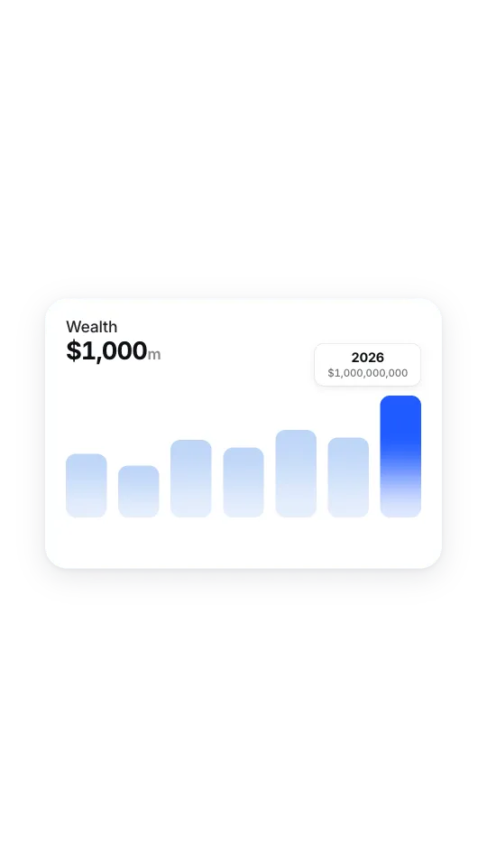
Bar chart
Bars rise into a gradient chart, the figure counts up and a tooltip lands on the bar that matters.
 Open in the editor
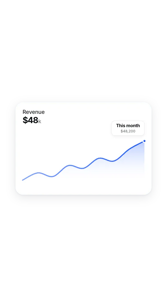
Line chart
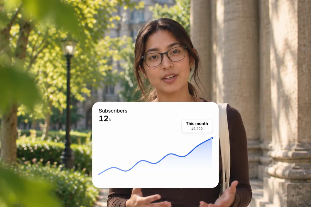
A line draws itself over a soft fill, with a counting figure and a tooltip on the last point.
 Open in the editor
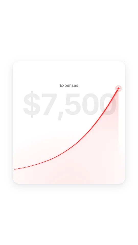
Glow line chart
A glowing line climbs while a huge figure counts up behind it. Built for one dramatic number.
 Open in the editor
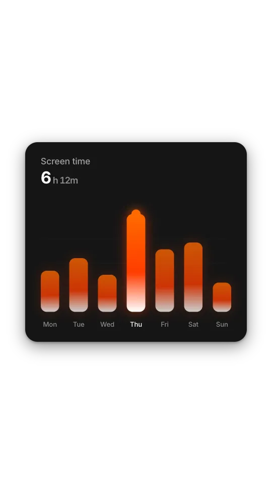
Glowing bars
A dark card of pill bars that glow from accent to white, with the peak capped by a dot.
 Open in the editor
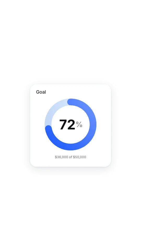
Ring progress
One rounded ring sweeps to its share while the percentage counts up in the centre.
 Open in the editor
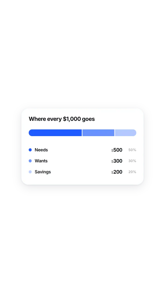
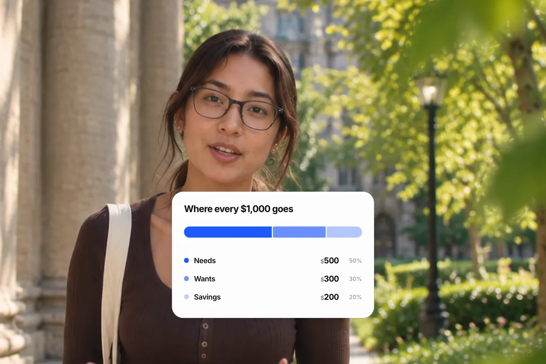
Budget split
One bar split into segments that grow, with a legend counting up how much goes where.
 Open in the editor
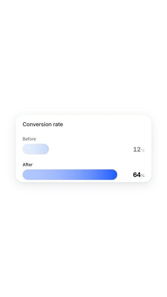
Before and after bars
Two bars race to their values and the winner takes the accent colour.
 Open in the editor
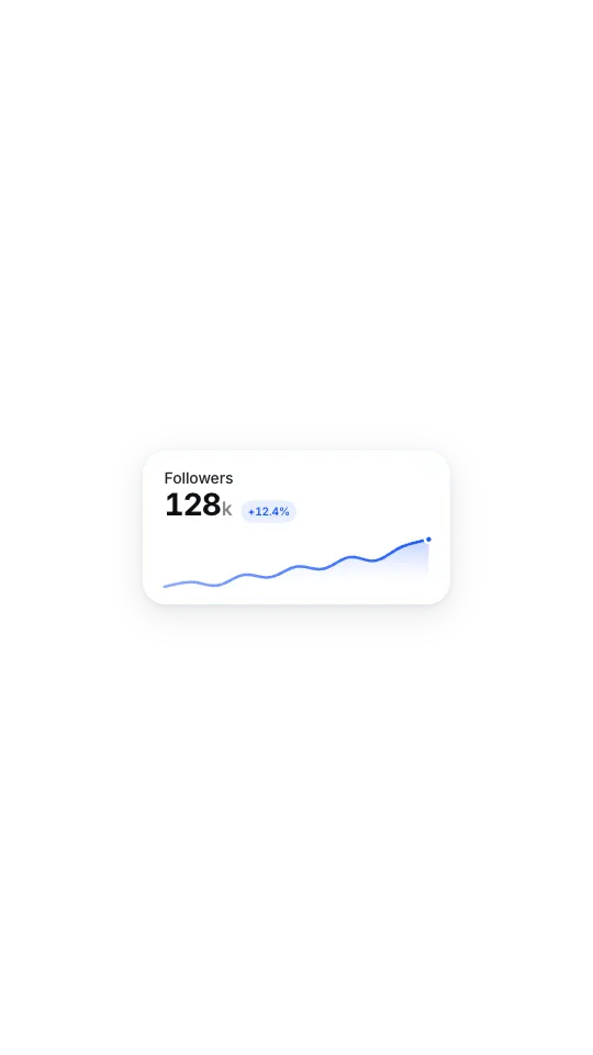
Sparkline stat
A compact figure with a change chip and a small line drawing itself underneath.
 Open in the editor
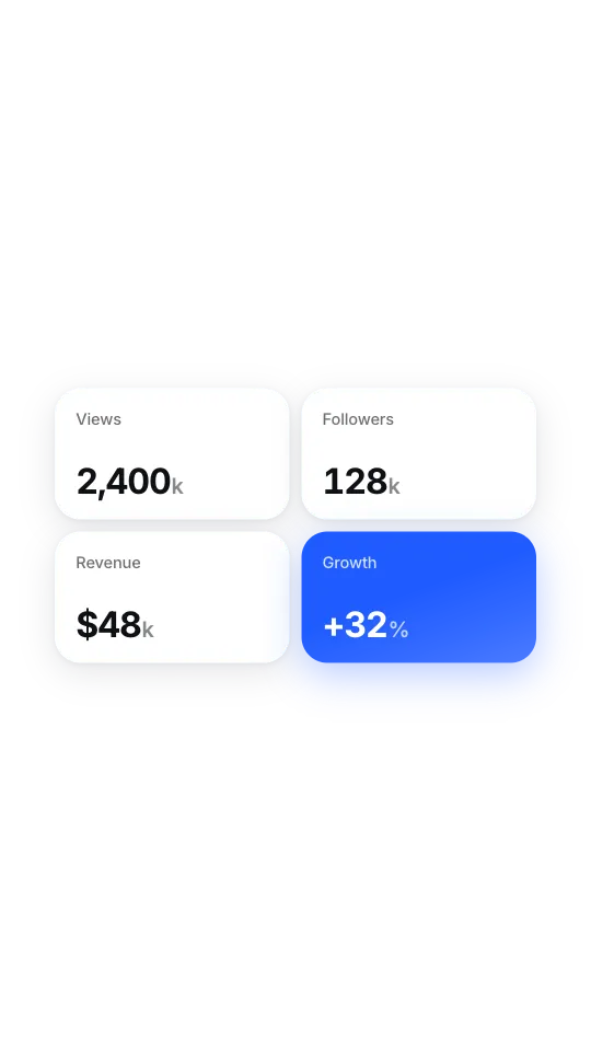
Stat grid
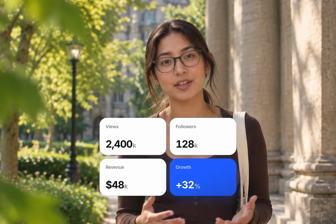
Up to eight small tiles stagger in, each figure counting up as its tile lands.
Animated bar chart makers compared: presentation tools versus video
Most chart makers are built for slides or dashboards. A chart for video has a different job: it has to land in a few seconds on a phone.
- 1
Slide charts export as pictures
Presentation tools give you a still image or a slide transition. Neither builds the bars in front of the viewer at the moment you mention them.
- 2
Dashboard charts are too dense
Axes, gridlines and legends are useful on a monitor and unreadable in a vertical video. These cards keep only the values, a title and one highlight.
- 3
Video charts tell one point
Each card is designed around a single takeaway, such as the tallest bar or the final figure, so the viewer knows where to look.

Which chart for which number
The right chart is the one that makes your point obvious in two seconds. Here is how to choose between the nine styles.
- 1
Bars to compare periods
Months, years or products side by side. The bar chart highlights one bar with a tooltip; glowing bars suit dark, moody edits.
- 2
A line for a trend
Growth over time reads best as a line. Use the glow line when the final number is the whole story.
- 3
A ring for one share
Seventy percent of a goal, a completion rate or a single proportion. The ring sweeps and the percentage counts up together.
- 4
Tiles for several stats
When three or four figures matter equally, the stat grid shows them all, each counting up as its tile lands.
Making a chart readable at phone size
A chart that looks fine on a laptop can turn into noise on a phone. These habits keep every style legible.
- 1
Five to seven bars at most
More bars means thinner bars and smaller labels. If you have twelve months, show the last six or group them into quarters.
- 2
Round the headline figure
$1.2m reads faster than $1,204,387. Keep the precise number for the tooltip if it matters.
- 3
One accent colour
Let the highlighted bar, line or segment carry your brand colour and keep everything else muted, so the eye goes straight to it.
- 4
Label the highlight
Use the tooltip or chip to say what the highlighted value means, like Best month or Q3, not just the number.
Timing the chart to your voiceover
A chart works best when it builds exactly as you talk about it. A few seconds of planning makes the whole video feel properly produced.
- 1
Start it on the number
Cut to the chart as you say the figure, not before. The count-up then lands with your sentence.
- 2
Give it a beat to hold
Let the finished chart stay for a second or two so viewers can read it, then cut back to your face.
- 3
Shorter growth for short video
On Reels, TikTok and Shorts, set a quick grow time. Slower builds suit YouTube explainers and slides you talk over.

Best Platforms for Animated Chart
- 1
YouTube
Explainers live on data. A chart that builds while you talk keeps viewers watching the number you are explaining instead of drifting off.
- 2
LinkedIn
Business results read as credible on a clean card. A rising bar or a before and after comparison turns a claim into evidence.
- 3
Instagram Reels
Finance and growth creators use quick charts as proof. Keep the chart short and let the counting figure carry the moment.
Animated Chart, answered
Is the animated chart maker free?
Yes. Every chart style runs in your browser and exports a 1080p MP4 with no sign-up and no watermark. Change the numbers and export again as often as you need.
Can I put my own data in the chart?
Yes. You type every value, the headline figure, the title and the tooltip or chip text. Bars and lines scale to your numbers automatically, so there is nothing to draw by hand.
Can I make a pie chart?
There is no classic pie chart. The ring progress card shows a single share as a sweeping ring, and the budget split card shows several shares as segments of one bar, which reads better on a phone.
Can I upload a spreadsheet or CSV?
Not yet. Each chart takes a handful of values typed into its fields, which suits video, where five to seven data points is the readable limit anyway. Round the values first.
Which chart works best for growth videos?
The line chart and the glow line chart show growth over time most clearly. For a single headline result, a before and after comparison or a sparkline stat card is faster to read.
Can I change the colours to match my brand?
Yes. Each chart takes an accent colour plus card and text colours, so the highlight, the background and the labels can all match your brand palette. One accent works best.
More free motion elements
- Number Counter Animation
- Money Counter Animation
- Date Countdown Animation
- Animated Timeline
- Lower third generator
- 3D text animation generator
- Google search animation generator
- Notification animation
- Sticker animation maker
- YouTube subscribe animation
- Text reveal animation
- Cutting mat generator
- All motion elements
Caption styles, platforms and tools
From the blog
How Video Captions Increase Watch Time by 40% (2026 Data)
The data is clear: videos with captions get more views, higher watch time, and better algorithmic reach. Here is what the research shows, why it works, and how animated captions outperform static ones.
Animated Captions for Faceless Video: Styles That Hold Attention
On a faceless video the captions are not a subtitle track. They are the performance, the emphasis, and the only brand asset that appears in every single frame. Here is how to choose and apply them.
Faceless Reels and TikToks: A Format Guide That Actually Names the Caption Style
Short-form is where faceless content is won or lost, and it is also where the safe zones, the mute default, and the three-second judgement are least forgiving. Here is the format-by-format breakdown.
Create a Free Animated Chart Motion Element
Free, no sign-up