Used by 8,000+ creators
3D Text Animation Generator
Type a word and watch it push out into real depth at the angle you choose, with the face and the body coloured separately. A free 1080p MP4, no 3D software.
Free, no sign-up
By Sumit DeyUpdated
What is the Extruded 3D Text?
This 3D text animation turns a word into a solid block of type. The front face stays flat and readable while a coloured body grows out behind it, so the word looks carved rather than shadowed.
How it works
The word appears flat, then its body extrudes backwards over the enter time you set, along the angle you choose. Depth, angle, both colours, the font and the size are yours. Long words shrink automatically so nothing runs off the canvas.
Made for
- Single-word hooks and punchlines
- Video intros and channel names
- Sale and launch announcements
- Gaming and sports highlight titles
- Thumbnail-style text inside the video
Extruded 3D Text in three steps
Step 01
Type one short word
Three to six letters carry the look best. Longer words work but shrink to fit, which thins the depth.
Step 02
Pick a font, colours, depth and angle
Choose from eleven typefaces, then set the face and body colours, how far the word pushes out and which way.
Step 03
Export the MP4
Pick 9:16, 16:9 or 1:1 and download a 1080p MP4. It runs in your browser with no sign-up.
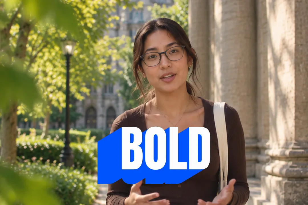
Real extrusion versus a drop shadow pretending to be depth
Most free 3D text effects stack a few offset shadows and call it depth. Extrusion builds a solid body behind every letter.
- 1
Shadows float, bodies attach
A drop shadow sits apart from the letter and reads as flat text with a smudge. An extruded body connects to every edge, so the word looks like an object.
- 2
Angle reads as light
Pushing the body down and to the right feels like light from the top left, which most viewers read as natural. Flip it for a dramatic, uneasy look.
- 3
Depth is a deliberate amount
You set the depth in pixels, from a thin plate to a deep slab, rather than guessing how many shadow layers to stack.

Keeping 3D text readable at phone size
On a phone, depth can turn into clutter fast. These choices keep the word legible in the half second a viewer gives it.
- 1
Light face, dark body
Readers see the face first. A white or pale face on a saturated body keeps the letter shapes crisp at any size.
- 2
Moderate depth for long words
The longer the word, the smaller it renders. Pull the depth back on long words so the body does not swallow the counters of each letter.
- 3
Heavy fonts extrude best
Thick condensed faces like Anton, Bebas Neue and Bungee give the body room to show. Thin scripts lose their shape once they have depth.
- 4
One word per moment
3D type is a headline, not a paragraph. Use it for one word at a time and let normal captions carry the sentence.

A 3D text generator for video, not a static image
Many 3D text generators make a still image for a logo or a post. This one makes motion, which is what an edit needs.
- 1
The depth grows on screen
The extrusion animates in, so the word arrives with energy instead of simply appearing. Set the enter time from a fast snap to a slow push.
- 2
It holds on your beat
The finished word stays at full depth for your chosen hold, so you can time it to a beat, a punchline or a voice line.
- 3
A still when you need one
Pause the preview on a held frame and screenshot it, or grab a frame from the MP4 in your editor for a thumbnail.

Where 3D text works in a video
Extruded type is loud by design, so it works best in a few places. Use it where a moment deserves the volume, and keep everything else quiet.
- 1
The first second of a video
A single 3D word like WAIT or WHY over the opening frame gives a viewer a reason to stay before you have spoken.
- 2
Reveals and punchlines
Drop the word on the exact beat of a reveal. The extrusion's movement draws the eye to it at the moment it matters.
- 3
Launches and announcements
NEW, SALE, LIVE and similar words look like signage in 3D, which is exactly the job they do in a product video.

Best Platforms for Extruded 3D Text
- 1
YouTube
A chunky 3D word reads like a thumbnail come to life. Use it for an intro title or a chapter word that matches the look of your thumbnails.
- 2
TikTok
One bold extruded word over a beat change makes a strong visual punchline. It reads instantly at phone size, even with the sound off.
- 3
Instagram Reels
Brands use 3D type for launch words like NEW or SALE. Set the body to the brand colour and keep the face white for maximum contrast.
Extruded 3D Text, answered
Is this 3D text animation generator free?
Yes. It runs in your browser and exports a 1080p MP4 with no account and no watermark. Make a separate version for every day of your run-up at no cost. There is no 3D software to install and no render queue to wait for.
How much text can I extrude at once?
It is designed for one short word, which carries the look best. Longer text is scaled down so it never runs off the canvas, which makes the letters and the depth smaller.
Can I change the extrusion angle and depth?
Yes. The angle can point in any direction around the word, and the depth runs from almost flat to a deep block. Both update live in the preview, so you can judge the look before exporting.
Which fonts can I use?
There are eleven typefaces, including Anton, Bebas Neue, Bungee, Oswald, Montserrat, Poppins, Playfair Display and Caveat. Heavy condensed faces give the clearest 3D result, because the thick strokes leave room for the body to show.
Can I use it as a video intro?
Yes. Type your channel name or a one-word title, set a slower enter time so the depth grows visibly, and place the MP4 at the very start of your edit, ideally on the first beat of your music.
Can I make a 3D text image instead of a video?
This tool exports video. For a still, pause on a held frame in the preview and take a screenshot, or export the MP4 and grab a frame in your editor.
More free motion elements
Caption styles, platforms and tools
From the blog
How Video Captions Increase Watch Time by 40% (2026 Data)
The data is clear: videos with captions get more views, higher watch time, and better algorithmic reach. Here is what the research shows, why it works, and how animated captions outperform static ones.
Animated Captions for Faceless Video: Styles That Hold Attention
On a faceless video the captions are not a subtitle track. They are the performance, the emphasis, and the only brand asset that appears in every single frame. Here is how to choose and apply them.
Faceless Reels and TikToks: A Format Guide That Actually Names the Caption Style
Short-form is where faceless content is won or lost, and it is also where the safe zones, the mute default, and the three-second judgement are least forgiving. Here is the format-by-format breakdown.
Create a Free Extruded 3D Text Motion Element
Free, no sign-up